Today is a big day for us here at Feed More. Today is the day we unveil our new brand and visual identity to the world! While our logo has changed, one thing has not. Our promise to the community – we care for and are here for our neighbors when they need us most.
With our bolder, mission-centric logo, we will be able to strengthen awareness, minimize confusion and connect all of our nine programs and network of close to 300 nonprofit agencies under one simplified brand.
“The passion, sophistication and heart that our organization embodies has evolved so much,” said Doug Pick, Chief Executive Officer and President of Feed More. “Feed More has become so much more than a food bank, more than a Meals on Wheels program and more than a Community Kitchen. We are a robust collection of programs and outreach – a true community backbone organization. To put it simply, we have become far more than the sum of the parts that brought us together 10 years ago.”
In 2005, Meals on Wheels Serving Central Virginia and the Central Virginia Food Bank came together to build a joint state-of-the-art facility to cost effectively create cooked-from-scratch meals. Focused on distributing food and healthy meals to neighbors who face hunger, the collaboration between these two grassroots organizations was a natural fit and on July 1, 2008 the nonprofits merged to create Feed More.
Since our inception, we have experienced a tremendous amount of growth. While the previous brand worked hard for a decade, the impact Feed More was making in Central Virginia today warranted a new, more streamlined brand hierarchy.
“We needed a brand that truly, and clearly, represented all that we are and all that we do to provide our neighbors with a hand up in their times of need,” said Suzy Rohler, Director of Brand, Marketing and Communications at Feed More. “With new positioning for Feed More, we have the opportunity to represent the people behind our mission, our supporters who help us carry out our mission and most importantly, the neighbors in need who our mission was created to help.”
Armed with thorough research from The Spark Mill and under the guidance of Board members Danny Robinson and Jeanne Sarmento, we worked closely with the local creative force Campfire + Co. to design a brand that is connected to the Feed More story and clearly represents who Feed More is and the life-changing work carried out every day.
“By simplifying our visual identity, we have shifted the focus of our brand from a focus on programs to a focus on service,” said Rohler. “Feed More is far more than just one program, one place or one partner. This logo represents a Feed More story we all can tell.”
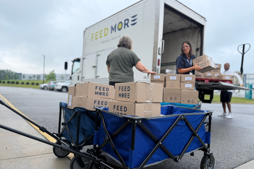
In addition to our updated look, we have also revamped our brand language, paring it down significantly. Feed More’s organizational focus can be summed up into three core actions: collect, prepare, distribute. These are inclusive of all that Feed More does in the community and embody the true evolution of the Feed More brand.
“While the total transformation of our logo is apparent, what hasn’t changed is our promise to our community,” shared Pick. “With roots in Central Virginia that date back more than 50 years, one thing will always remain the same – we care and are here for our neighbors when they need us most.”
We’d love for you to learn more about our brand journey and to dive into the anatomy of our logo.